Are the users of your website having an enjoyable user experience? Or are you playing games with them, by boring them to death with walls of words and confusing calls-to-action?
Quit playing games
You’ve got to stop playing games with your website, and start some serious studying of games. Yep, games, like video games.
Before you think I’ve gone nuts, I’m not alone here. Karl Kapp, along with other learning industry experts, have spoken about gamification for years. You can even take courses on the subject now. Gamification is where you bring game-design principles to situations that aren’t games, such as learning experiences. I first heard about gamification at an ATD conference, but the concept has been around for decades.
For example, I know what a trebuchet is by playing hours of Civilization. Aren’t you impressed?
Oh. Well, anyway, here’s the cool thing: You can take those same principles and use them on your business website.
User Experience Principles from Classics
Here’s some ways to level up your users’ experience on your website, using ideas from my favorite classic Nintendo games.
Give rewards for effort: Super Mario Bros.

In Super Mario Bros, you collect coins and hit bricks with your head to get more coins. Hit bricks with the question mark and you can get Super Mushrooms, Fire Flowers and even 1-Ups. And if you jumped higher on the flagpole, you’d sometimes be rewarded with fireworks. When you play the game, you could just move from left to right and avoid all the bonuses, but most often we want to get as many coins and bonuses as we can.
Takeway: Give your audience bonuses that add value when they follow the path you want them to take. Offer value-adding content such as downloadable worksheets, cheat sheets, small little things that add value. I suggest website owners create a spending plan for content creation, so they can continuously reward users with new bonuses of content.
Help Users Right Away: The Legend of Zelda

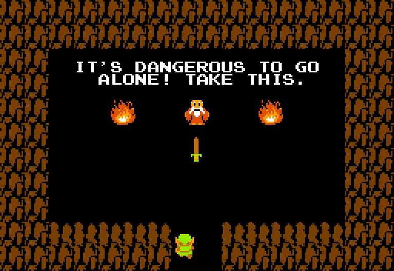
In the first Legend of Zelda game, the first screen you see has an open door to a cave. Enter the door and the old man says “It’s dangerous to go alone. Take this!” He then gives you a sword to help you along the way. It’s so obvious it’s almost impossible to miss.
Takeaway: Make sure your homepage immediately gives users the tools they need to succeed on your website. If success looks like signing up for your newsletter, then make it the first thing they see. If success looks like contacting you for services, then make that the first thing they see. I suggest website owners to create some SMART goals for their website, so they can make priorities soon what content appears first.
Provide a Clear Path: Castlevania

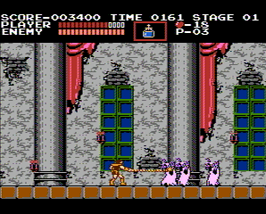
In Castlevania, Simon Belmont has a pretty simple path to follow: go left to right and whip Dracula’s minions until you get to the boss. Even though there are stairs that send Simon in a different direction from time to time, the goal is clear: Go from left to right to defeat Dracula.
Takeaway: Make a clear path to direct users where you want them to go. This is why it’s important to know your WWW: Who your audience is, What you want them to do, and Why.
So as crazy as it seems, you can learn some great ways to improve your website, all from studying classic video games.
Did you know you can learn some blunders as well? Next week, we’ll look at how the sequels of these classic games dropped the ball, and how you can learn what not to do on your website.
Screenshots of images courtesy of Wikimedia with respect to Nintendo and Konami.