Want to see the ugliest website ever made? You’ll be surprised who designed it.
1995. The year I graduated from high school. The year I designed my first website.
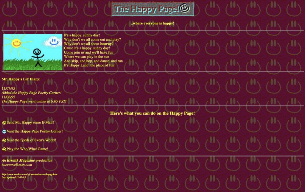
It was called “The Happy Page”. Here’s what it looked like:

Before you laugh and forget about COVID-19 for a few minutes, keep in mind that I had just graduated from high school and had zero web design experience. I think Tim Berners-Lee might have only had a few years of experience ahead of me. And CSS (Cascading Style Sheets) hadn’t even been released yet.
There were no WYSIWYG editors. No WordPress. Nothing. If you wanted to create a website, you needed to write HTML from scratch.
The beauty of HTML is that it still works, even after almost a quarter of a century later. I still remember the tools I was using: Corel Draw and Windows Notepad. Not Notepad++, just plain Notepad.
What’s changed since 1995
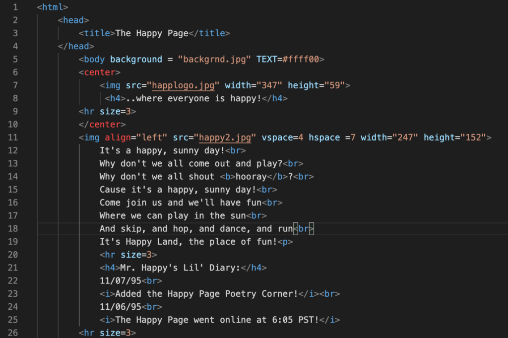
Taking a peek into the code for the Happy Page, it’s amazing the code still works, even the silly marquee tag. However, things have radically changed since a quarter century ago.

This HTML code from 1995 is a plethora of worst web development practices.
Styling using CSS
In the olden days, I would style a webpage using HTML elements and attributes. Want to center some content? Use the center tag.
Shortly afterward, styling was handled by CSS, which does a much better job and allows developers to somewhat separate content structure from visual design.
Semantic elements in HTML5
The other major development since 1995 was HTML5 semantic elements, which provide a way of telling computers and humans more about the content structure, rather than just having a mess.
Wouldn’t it be fun to try replicating this website it it’s hideousness, but using the latest HTML and CSS technologies?
https://codepen.io/AaronTweeton/pen/bGVGdQv
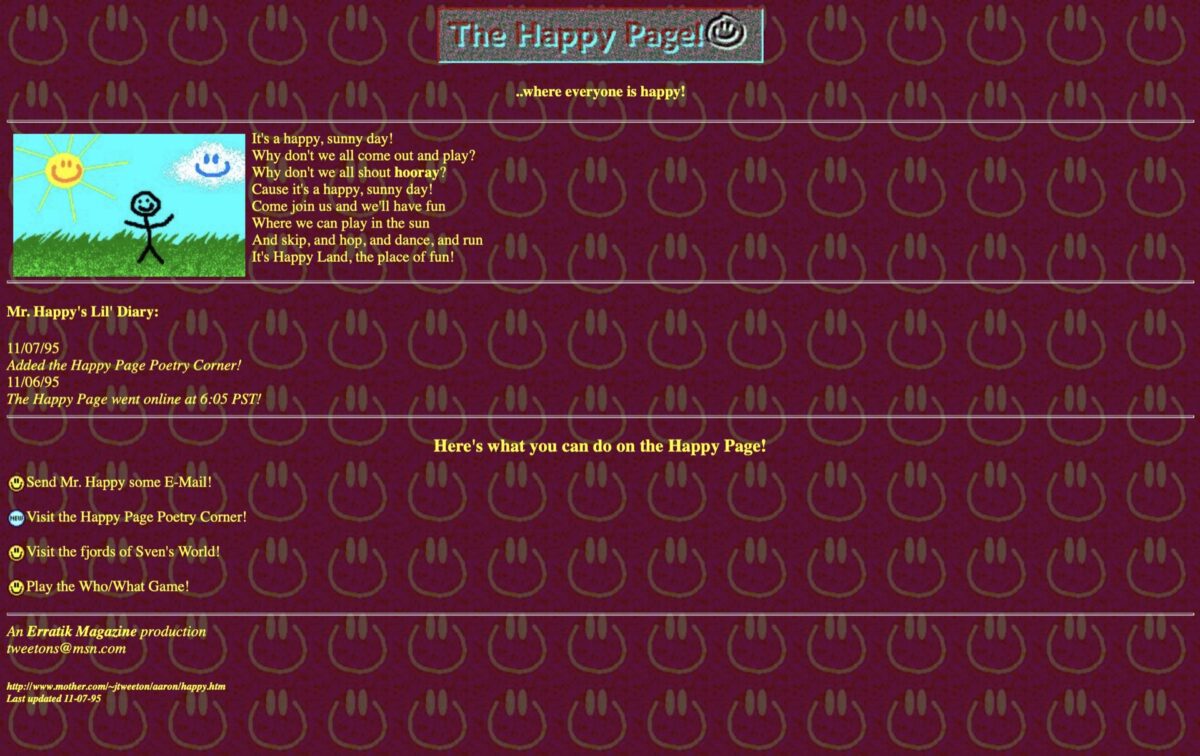
So here’s the Happy Page, refactored to make it a little more compliant with today’s browsers.
As embarrassing as it is to look at now, the Happy Page was the first step in my career as a web developer.
