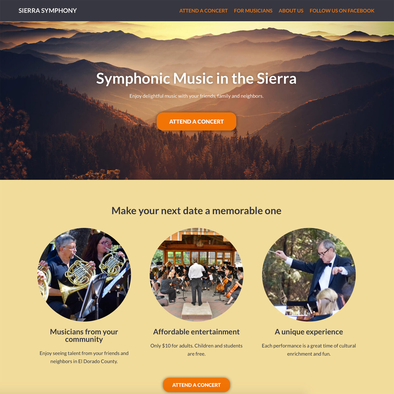
Here’s how I redesigned a website for a local symphony using Adobe XD for web design along with Google Docs, WordPress and Elementor.
Google Docs for copywriting. Adobe XD for web design. WordPress for structure. Elementor for designing pages.
Those are the four tools I recently used together to redesign a website for a local symphony in El Dorado County. I’m going to share how I used each and how you can use them to design your own websites.
Writing fresh copy in Google Docs
When people think of web design, they sometimes get caught up in worrying about fancy fonts, cool colors and graphics that grab attention. But I think it’s best to start with fresh copy written to sell.
So for a local symphony, I rewrote their copy using principles I learned from the Marketing Made Simple course from StoryBrand. Using a free tool like Google Docs, both I and the stake holders could collaborate and make changes together.
Using Adobe XD for web design and user experience
After the copywriting was taken care of, it was time to prototype using Adobe XD for web design. I love Adobe XD’s simplicity and ability to share a working prototype with clients, where they can preview what a site should look like and make comments. It sure beats the old days of having to email a bunch of screenshots back and forth.
You can create some delightful user experiences in Adobe XD using some of their prototyping and animation tools. However, you can also design with the limitations of the end product in mind. In this particular case, I knew I was going to be using WordPress and a specific page-builder plugin to design the site, and I didn’t want to over-complicate things.
I’ve been using Adobe XD for several years and it’s been a great way to visually confirm that both the web designer and client are on the same page (no pun intended).
Building the website on WordPress
After the prototype was created and reviewed, it was time to move onto building the site on WordPress. This project was a revamp, with the old website still existing on WordPress, so there wasn’t much to change there.
For the theme, I chose Neve from Themiscle. Neve is a free lightweight theme that’s fairly customizable. I chose it after watching a great course on LinkedIn Learning that showed how to design a website in Adobe XD and Elementor.
I’ve found Neve to be a close shave better than GeneratePress, which is another free lightweight theme.
To showcase symphony events, I installed The Events Calendar plugin by Modern Tribe. This plugin gives you features like directional maps and allows users to download the event to their digital calendar.
Many of the photos were professionally taken, but I used some stock photos from Envato Elements to provide backgrounds.
Designing web pages using Elementor
For designing pages, I chose to use Elementor because it allows you to create customized landing pages without spending a bunch of time coding. I’ve tried out different page builders over the year and have found Elementor to be well balanced where you can get a lot of creative control without slowing down your site too much.
If I could design this website again
Seems like every web design project I finish, I end up thinking, “Ooh, I should have done it this way.” Perhaps one difference I might make is using the WordPress Block Editor and an Block Editor plugin like Stackable, instead of using Elementor.
Elementor is great for designing media and animation rich webpages running on top of WordPress. However, it takes a little longer to set up, and attempting to make SEO changes are more difficult than if you’re using the WordPress Block Editor.
