Here’s how to get started configuring theme.json to work for your WordPress block based theme.
One of my biggest gripes with the current documentation for Full Site Editing is how it explains the usage of theme.json. Gripes aside, I’m going to try my best to explain how it works.
Let’s start with this, which is essentially an empty theme.json file aside from the version number and an empty settings object:
{
  "version": 1,
  "settings": {}
}
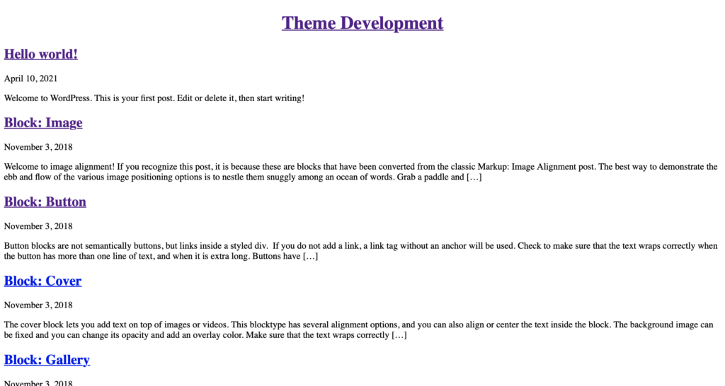
…which results in a bare bones theme showing nothing spectacular:
Adding layout settings
Let’s add some layout settings to theme.json so it looks like this:
{
  "version": 1,
  "settings": {
    "layout": {
      "contentSize": "720px”,
      "wideSize": “1200px"
    }
  }
}
These new settings do the following:
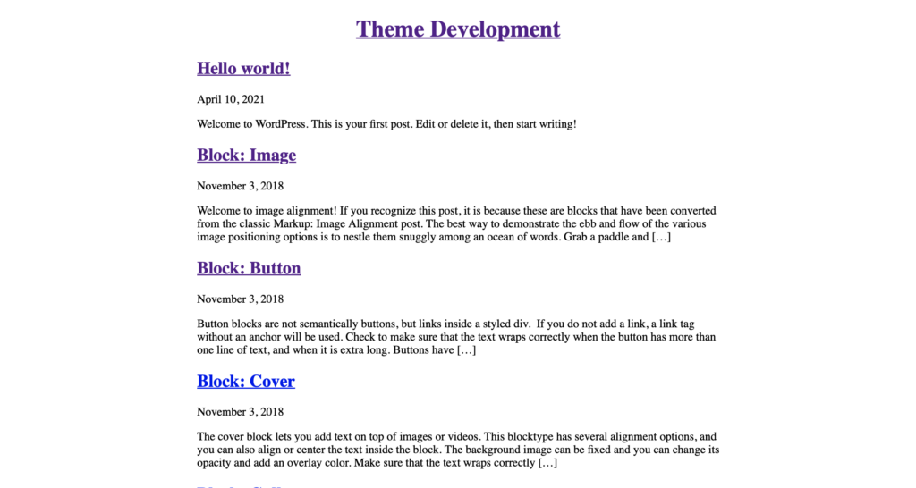
- contentSize: Sets the default width of your content, in this case to 720 px wide.
- wideSize: Sets the width of any blocks you set to Wide width, in this case 1200px wide.
This results in a slight change for the home page:
Adding colors
Let’s add some colors to the theme. First, we’ll need to add colors to our palette, and then apply them to the theme.
WordPress 5.8 ships with 16 default palette colors, but we’re going to configure our own using theme.json, using hex values from the Commodore 64.
"settings": {
  "color": {
    "palette": [
      {
        "color": "#0000aa",
        "name": "Blue",
        "slug": "blue"
      },
      {
        "color": "#0088ff",
        "name": "Light Blue",
        "slug": "light-blue"
      }
    ]
  },
  "layout”: {...}
}
Now if you look at the front end of the theme, nothing changes, but what does change is now these two colors are available in the theme’s global styles.
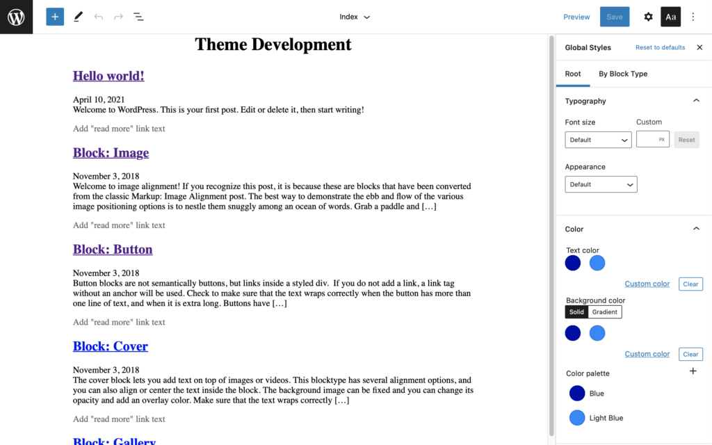
Not only are the colors available for usage in the Global Styles, but are also available as CSS variables to be used elsewhere:
- –wp–preset–color–blue
- –wp–preset–color–light-blue
Applying the colors to the theme
To apply colors to parts of the theme using theme.json, we need to add a styles object underneath the settings object like this:
{
  "version": 1,
  "settings": {...},
  "styles": {
    "color": {
      "background": "var(--wp--preset--color--blue)”,
      "text": "var(--wp--preset--color--light-blue)”
    }
  }
}
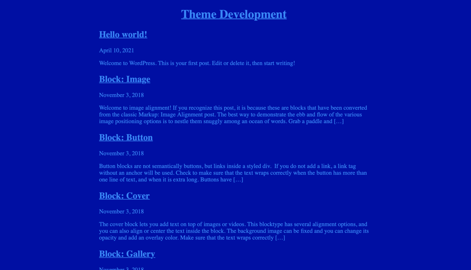
Now the theme looks like this:
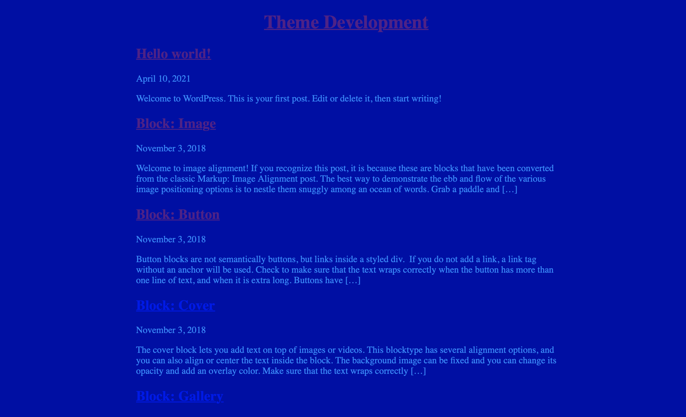
There’s a problem noticeable right away, aside from the illegibility of the text: the links are still using the default colors. Let’s fix that by adding styles to the links as well.
"styles": {
  "color": {
    "background": "var(--wp--preset--color--blue)”,
    "text": "var(--wp--preset--color--light-blue)”
  },
  "elements": {
    "link": {
      "color": {
        "text": "var(--wp--preset--color--light-blue)”
      }
    }
  }
}
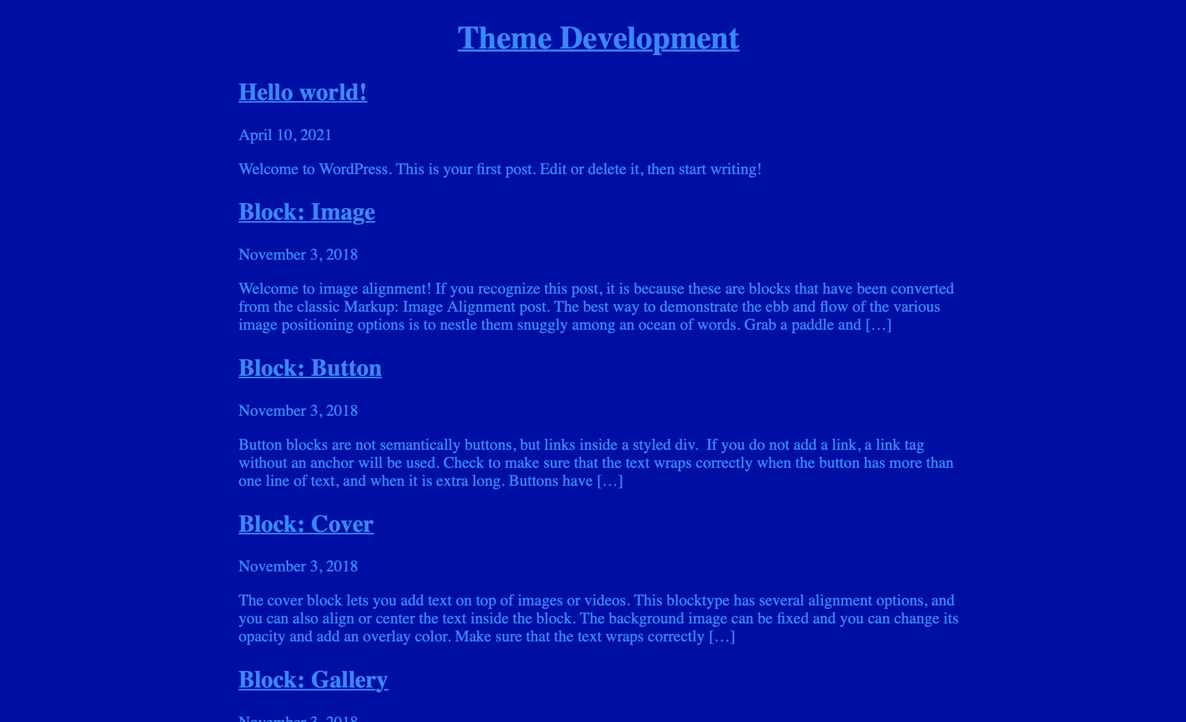
Now we’re applying the same CSS preset to the link color. If you’re familiar with CSS, the way these styles are organized are a bit confusing, but that’s why I wanted to show step-by-step how this works. Let’s take a look at the theme now:
That was a lot to cover and there’s still a lot of work to do. My theme doesn’t look anything like a Commodore 64 screen yet, but we can get it closer. Next time we’ll look at how to apply font styles and other settings to get closer to what we’re looking for.
